


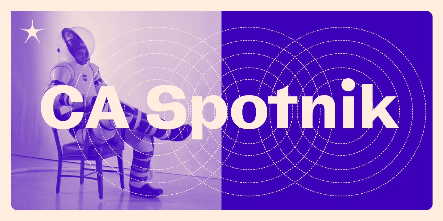
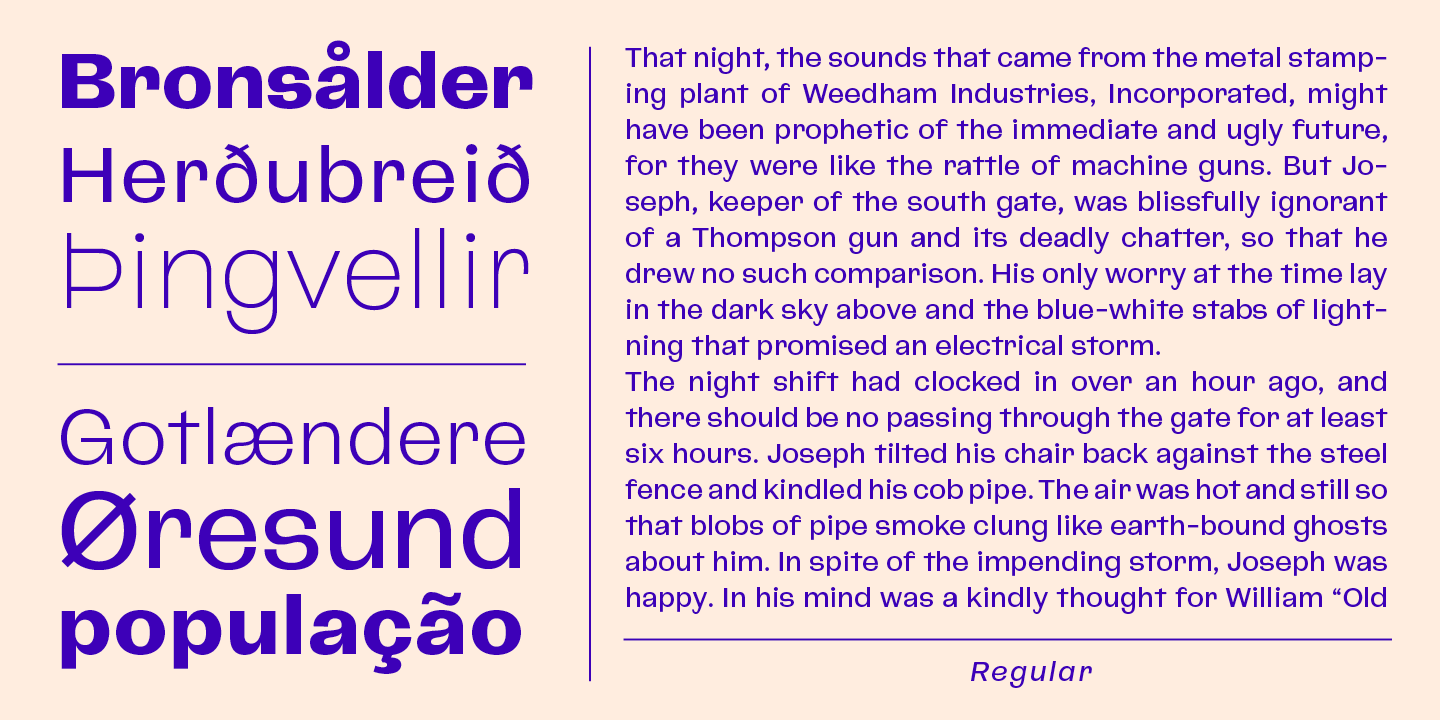
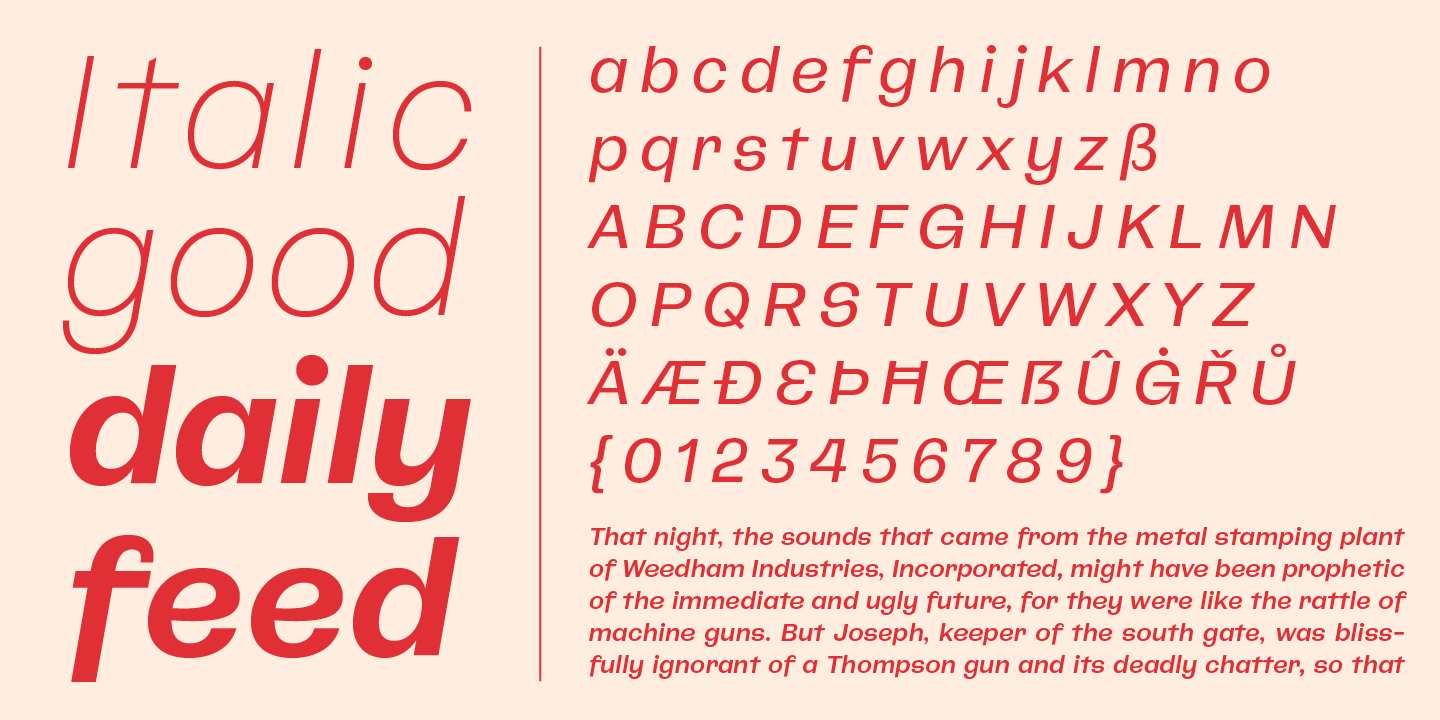
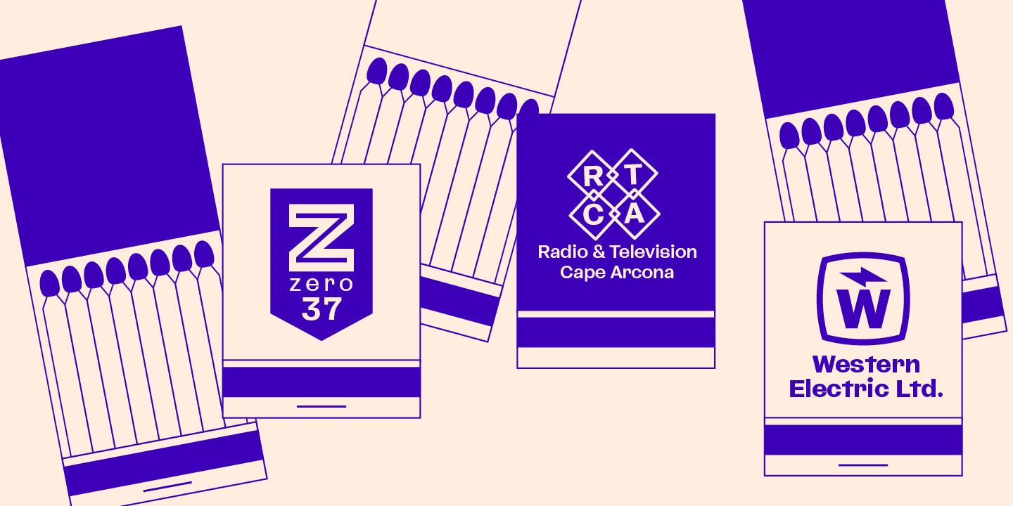
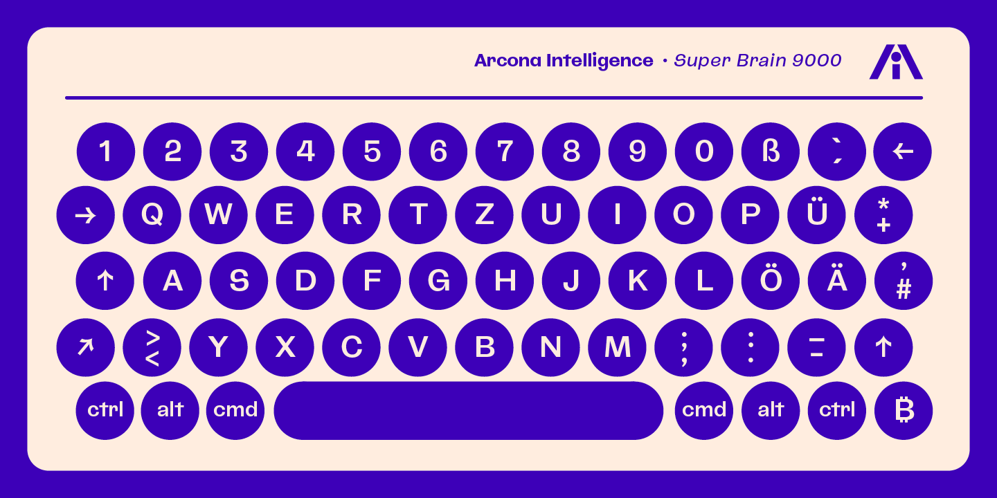
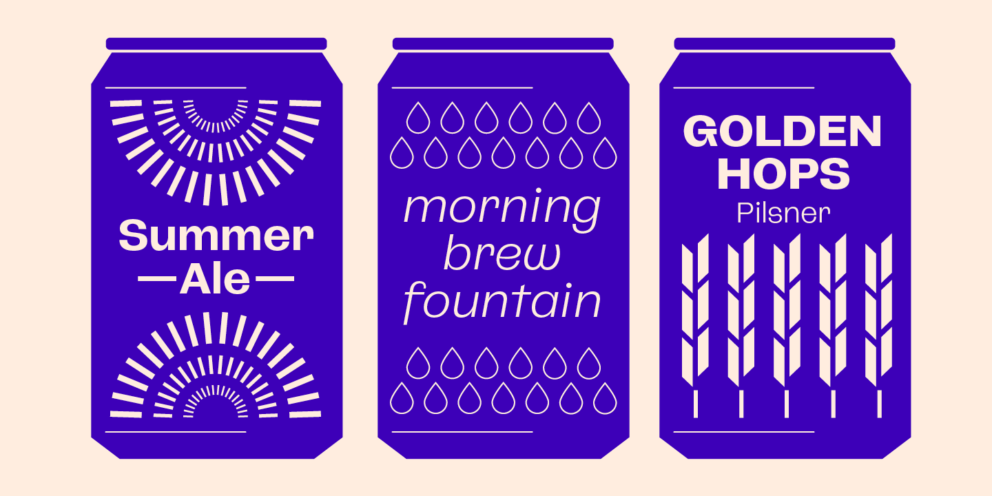
The initial inspiration for CA Spotnik was the opening title of an early Andrei Tarkovsky movie. There was this very unconventional hand drawn “s” which drew my attention. Despite its strange shape, it felt totally natural in that context. So we made a few screenshots and started to sketch some more letters to catch the spirit that attracted us so much. The result is a grotesque typeface with a slight contrast, the proportions are rather wide with a large x-height.
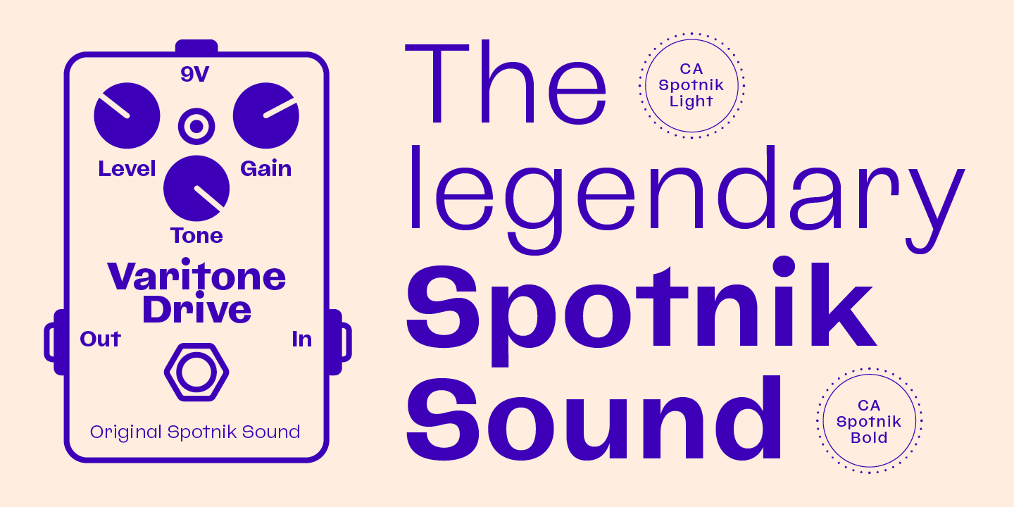
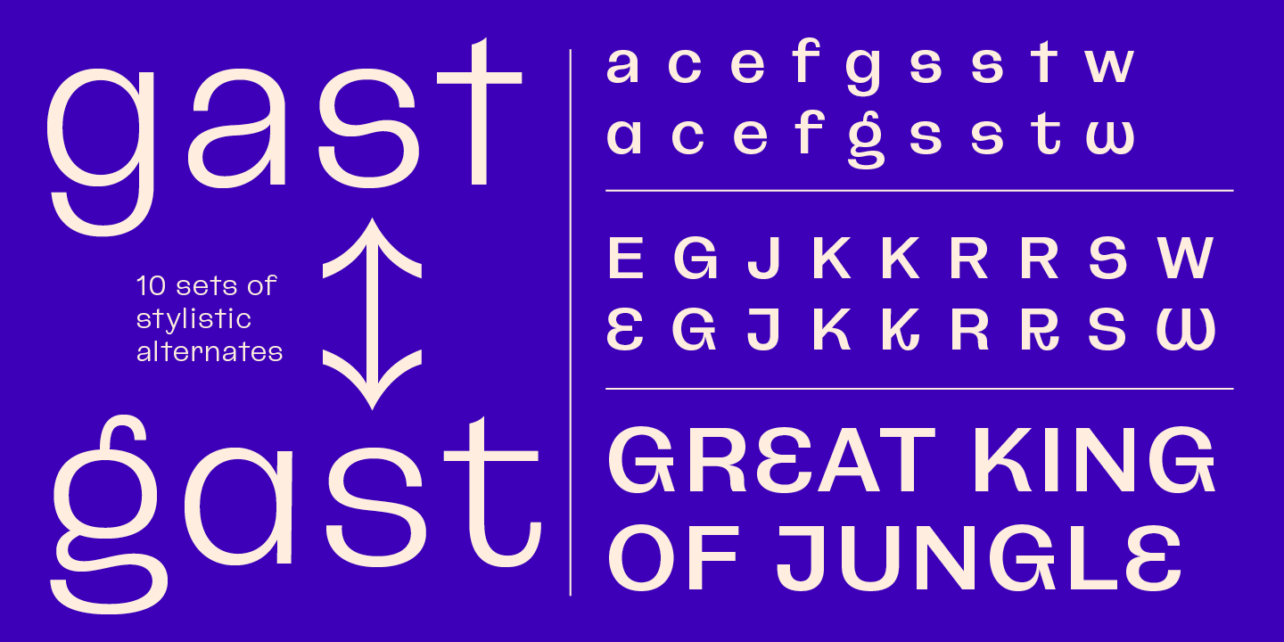
The bolder the weight, the wider it gets. In case you find the swirly “s” uncomfortable, there is a standard s included as well. The general atmosphere of the typeface, which could be described as “nerdy but friendly” doesn’t depend on this detail. It’s rather the sum of details derived from the original inspiration.
If you want to say goodbye to tristesse, say hello to Spotnik.
Designed by:
Stefan Claudius
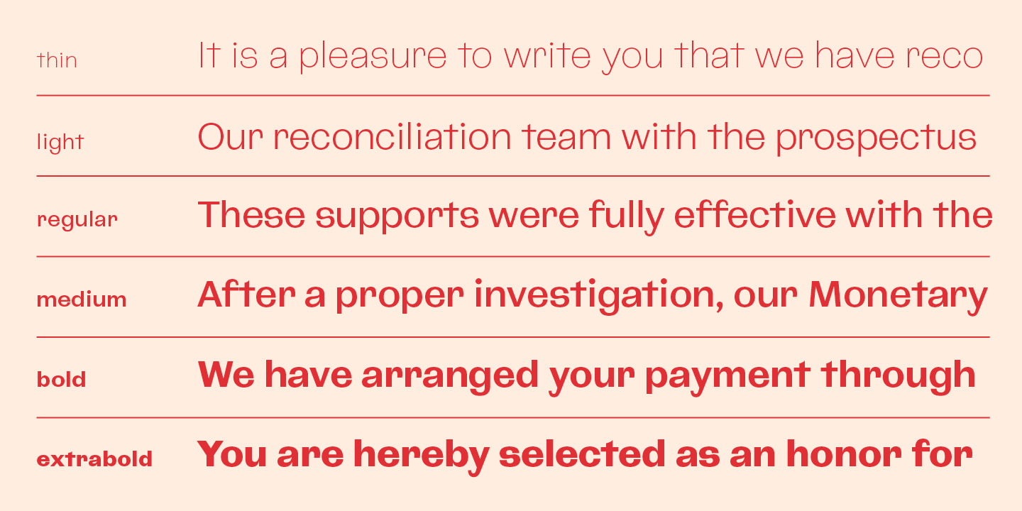
Styles: 12
+ Variable Font
Supported Languages:
Western encoding
Central European encoding
Latin Extended encoding
OpenType Features:
Stylistic sets (ss0x)
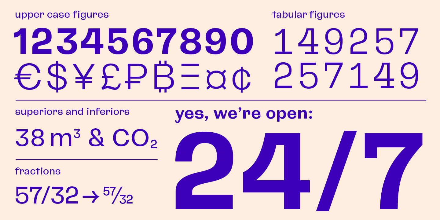
Slashes zero (zero)
Fractions (frac)
Ordinals (ordn)
Superscript (sups)
Superiors / Inferiors (subs/sinf)
Proportional lining (pnum+lnum)
Tabular lining (tnum+lnum)
Specimen
Characters, features, etc.
Download PDF
Trial fonts
Trial fonts for non-commercial use
Download
End User License Agreement
By downloading and/or installing CAPE ARCONA TYPE FOUNDRY fonts software, you acknowledge you have fully read and understood all terms within our EULA.
TRIAL/TEST FONTS
With a free trial license, you can use our test fonts to decide if you want to purchase a license.
FREE FONTS
Free fonts are free for all non-commercial uses. If you intend to use it in a commercial way, you need to buy a commercial license.