


CA Slalom started with a simple ambition: take the spirit of classics like Gill and Antique Olive and give it a contemporary spin – same focus on aesthetics, flexibility, and everyday usefulness, just rebuilt for how type gets used today.
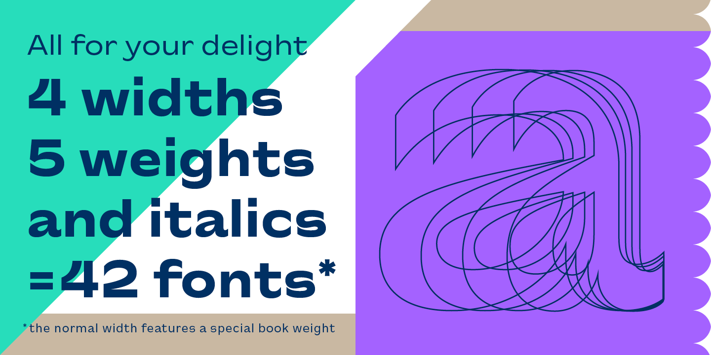
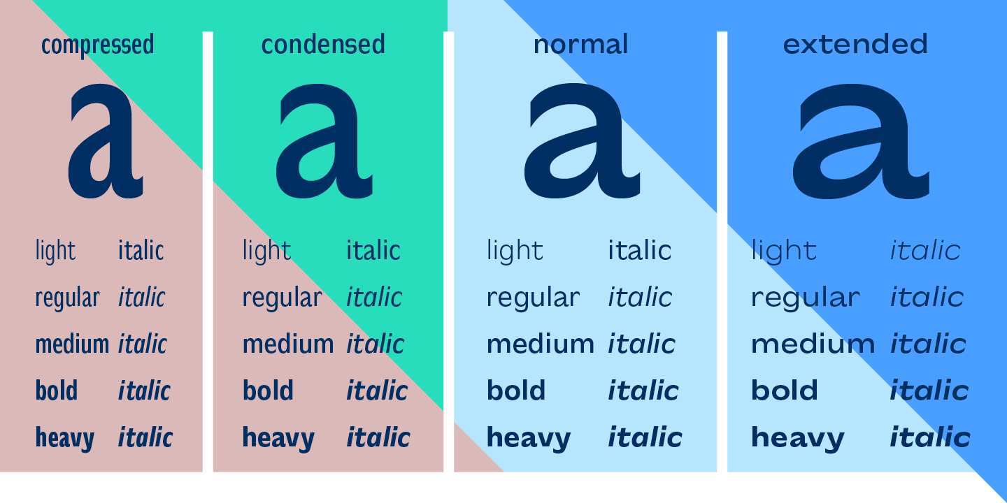
The S ended up being the breakout shape. Its curve was so distinctive that it became the visual anchor for the whole family. Working from that extra bold extended weight outward, CA Slalom grew into a proper type family, spanning four widths that all share the same underlying logic.
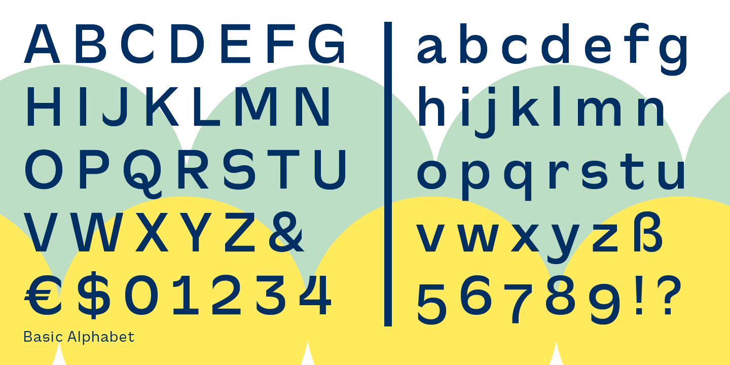
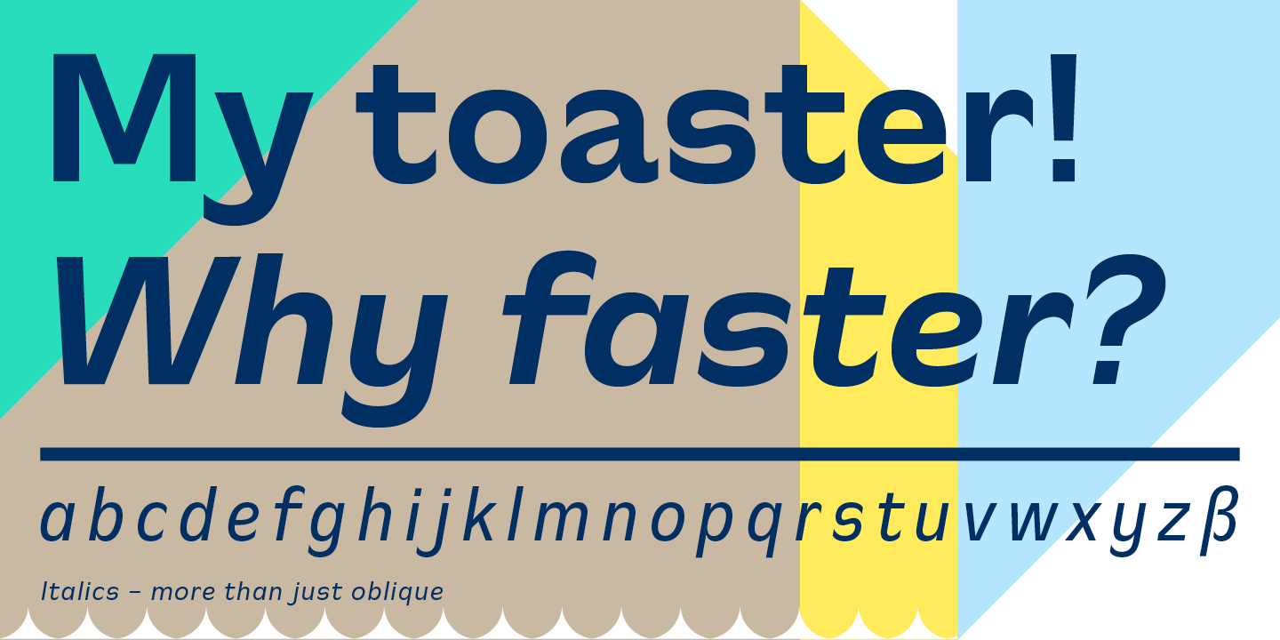
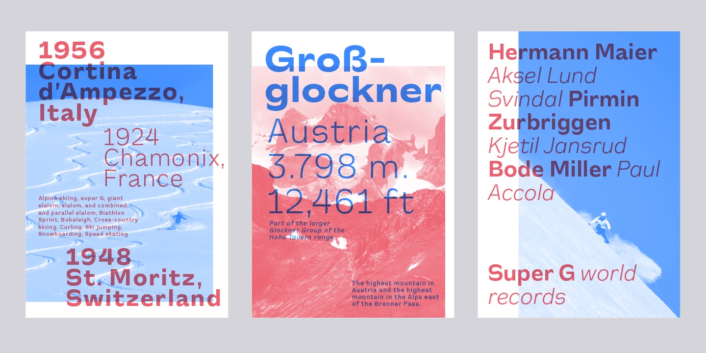
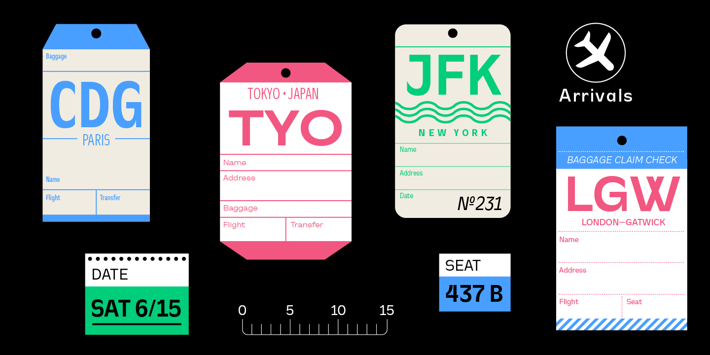
Looks-wise, it leans round rather than square. The stroke-ends pull in deep, almost like they're tucking under themselves, and the x-height sits a bit lower than you'd expect. None of these are loud design choices on their own, but together they give CA Slalom a personality that's difficult to mistake for anything else.
It's a typeface that feels clearly of its time, but it doesn't chase trends just to feel current. There's enough restraint and structure in it that it could easily age into something people reach for the way they reach for Gill or Antique Olive now – not because it's flashy, but because it works.
Designed by:
Stefan Claudius
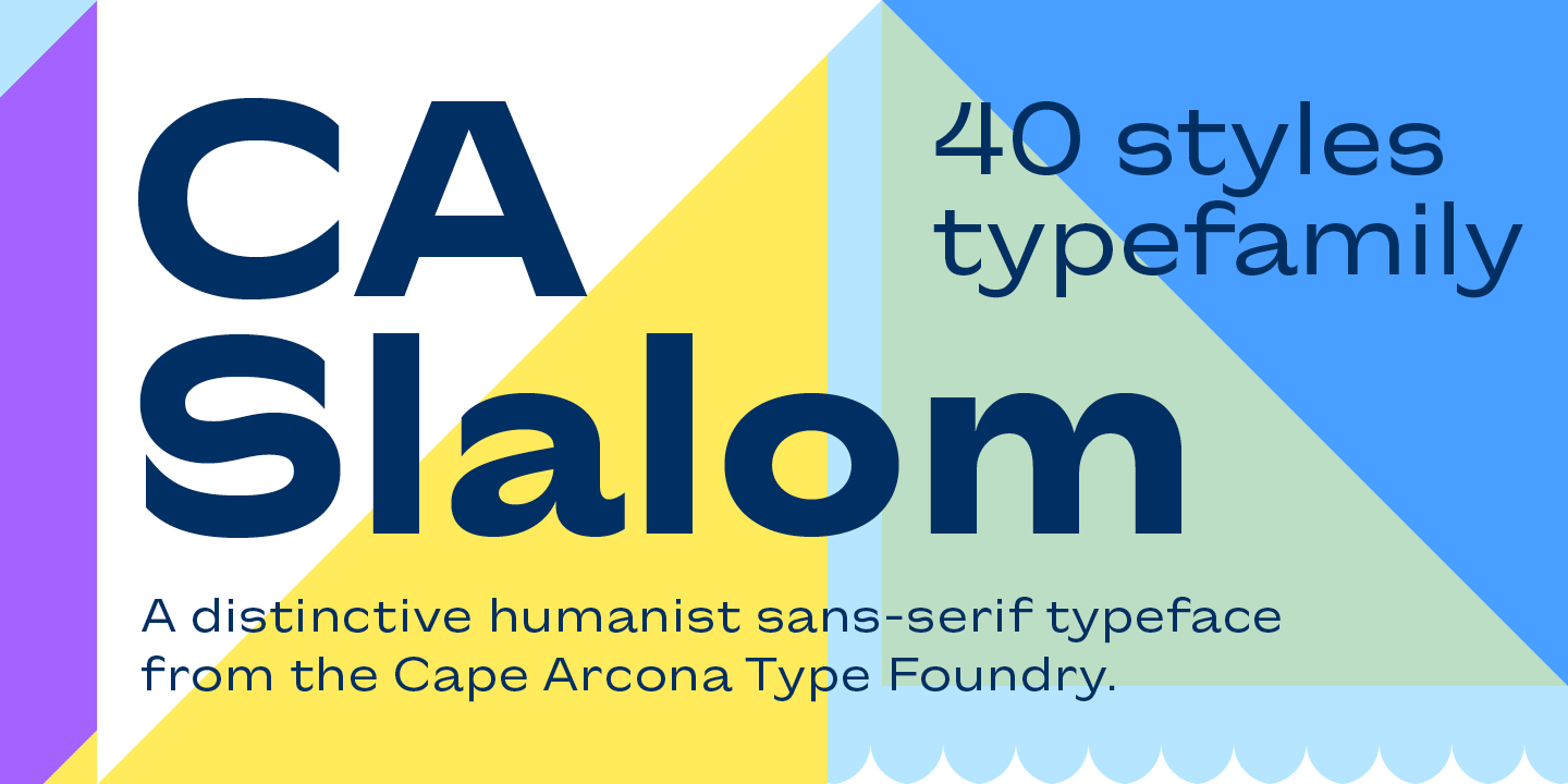
Styles: 42
+ Variable Font
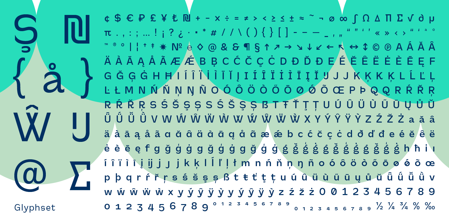
Supported Languages:
Western encoding
Central European encoding
Latin Extended encoding
Cyrillic encoding
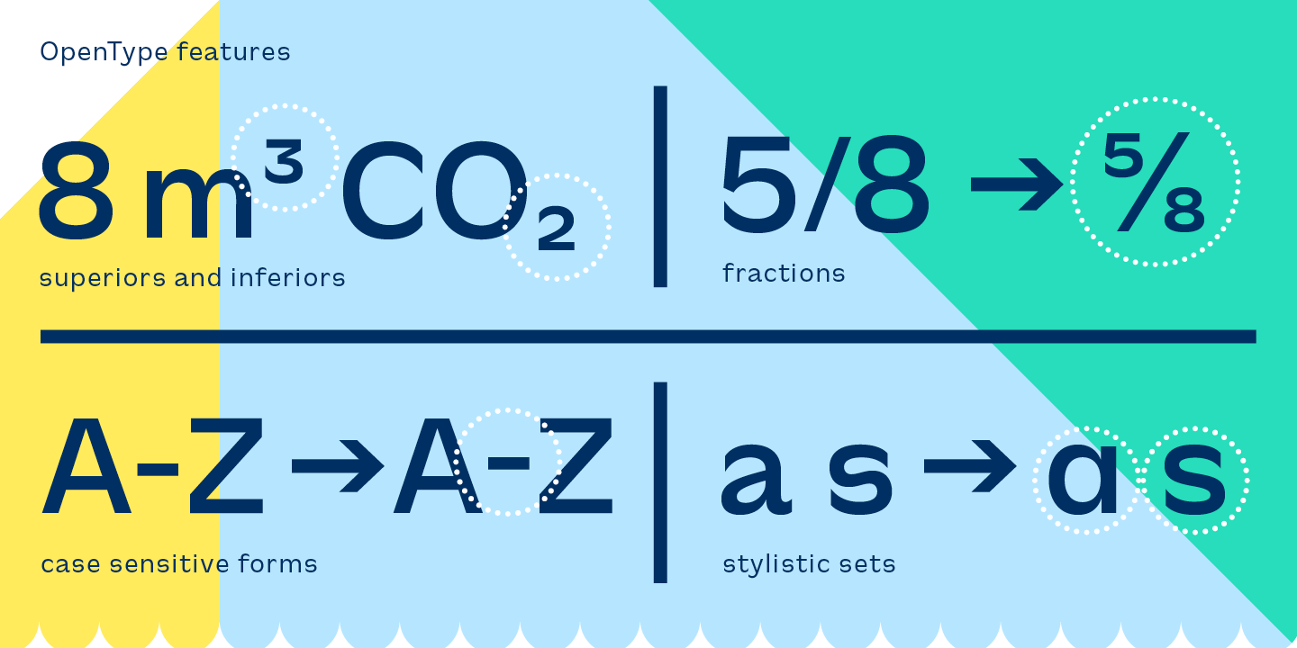
OpenType Features:
Discretionary ligatures (dlig)
Contextual alternates (calt)
Stylistic sets (ss0x)
Slashes zero (zero)
Fractions (frac)
Ordinals (ordn)
Proportional old-style (pnum+onum)
Proportional lining (pnum+lnum)
Tabular lining (tnum+lnum)
Tabular old-style (tnum+onum)
Superiors / Inferiors (subs/sinf)


Specimen
Characters, features, etc.
Download PDF
Trial fonts
Trial fonts for non-commercial use
Download
End User License Agreement
By downloading and/or installing CAPE ARCONA TYPE FOUNDRY fonts software, you acknowledge you have fully read and understood all terms within our EULA.
TRIAL/TEST FONTS
With a free trial license, you can use our test fonts to decide if you want to purchase a license.
FREE FONTS
Free fonts are free for all non-commercial uses. If you intend to use it in a commercial way, you need to buy a commercial license.