


CA Normal aims for beauty without tricks — just clarity and well-balanced proportions.CA Normal aims for beauty without tricks — just clarity and well-balanced proportions. It pulls from European grotesques and American gothic, mixing the two into something that feels like its own thing. The concept stays in the background, which is exactly the point. True neutrality might not exist, but CA Normal gets closer to it than most.
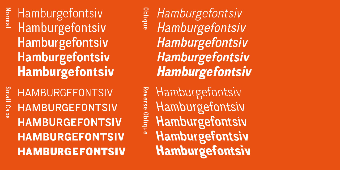
Good text typefaces can't be too smooth or too restless. CA Normal handles this by slipping in small, slightly uneven details that keep the reader's eye moving without being distracting. The oblique follows the grotesque tradition — no separately drawn italics, just a slanted version of the roman. There's also a reverse oblique, a style you usually only see on maps, which is a nice surprise.
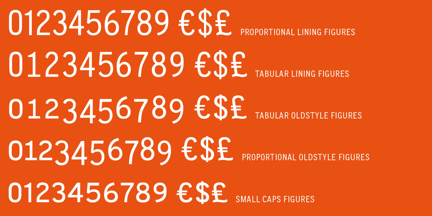
Underneath the clean surface, the font is well-equipped: small caps, a central European character set, a wide range of numerals, and plenty of ligatures. By default, CA Normal sets numbers as proportional lining figures. If you'd rather use old-style or tabular figures, just switch them via the OpenType options in your layout program.
Designed by:
Stefan Claudius
Styles: 15
Supported Languages:
Western encoding

Specimen
Characters, features, etc.
Download PDF
Trial fonts
Trial fonts for non-commercial use
Download
End User License Agreement
By downloading and/or installing CAPE ARCONA TYPE FOUNDRY fonts software, you acknowledge you have fully read and understood all terms within our EULA.
TRIAL/TEST FONTS
With a free trial license, you can use our test fonts to decide if you want to purchase a license.
FREE FONTS
Free fonts are free for all non-commercial uses. If you intend to use it in a commercial way, you need to buy a commercial license.