

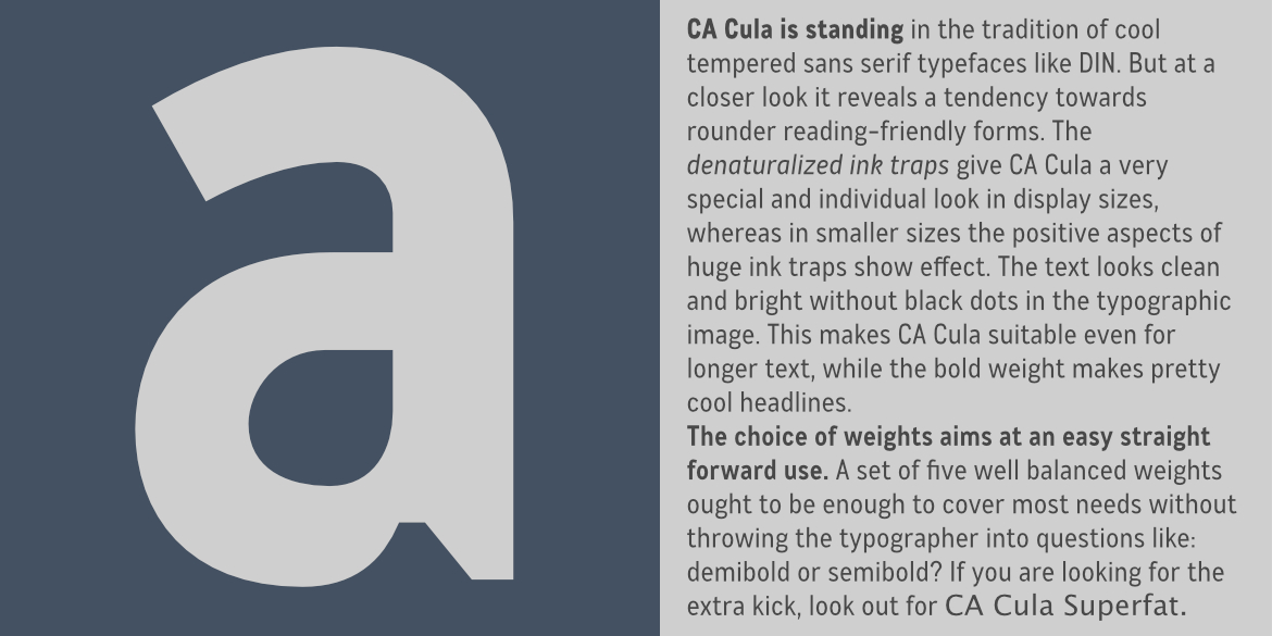
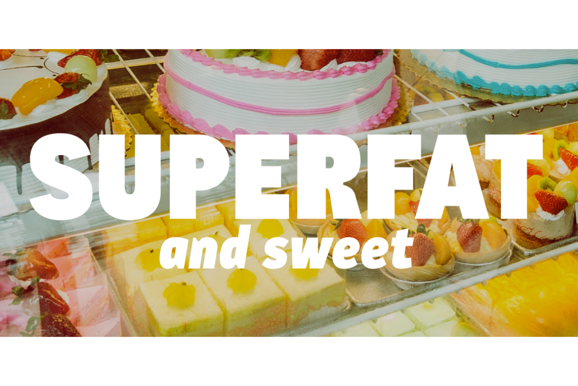
At first glance, CA Cula feels familiar – it carries that same “cool-tempered” DNA you might find in classic industrial faces like DIN. However, if you look closer, you'll see it’s a lot more human. It swaps out rigid coldness for rounder, friendlier shapes that make reading feel less like a chore and more like a conversation.
What really sets it apart are the denaturalized ink traps. They serve two distinct purposes depending on how you use them:
-
At Large Sizes: They act as a unique design feature, giving headlines an individual, modern character.
-
At Small Sizes: They do exactly what they were originally designed for—preventing ink bleed and keeping the text crisp.
The result is a typographic “image” that feels bright and open. You won't see those heavy “black dots” or clogged corners that often plague long paragraphs. It’s clean enough for body copy, yet the bold weight is punchy enough to carry a headline on its own.
We also kept the weight selection intentionally simple. Instead of overwhelming you with endless variations (and the inevitable semi-bold vs. demi-bold headache), we’ve provided five well-balanced weights. It’s everything you need to get the job done without the unnecessary guesswork.
Designed by:
Thomas Schostok
Styles: 10
Supported Languages:
Central European encoding
Specimen
Characters, features, etc.
Download PDF
Trial fonts
Trial fonts for non-commercial use
Download
End User License Agreement
By downloading and/or installing CAPE ARCONA TYPE FOUNDRY fonts software, you acknowledge you have fully read and understood all terms within our EULA.
TRIAL/TEST FONTS
With a free trial license, you can use our test fonts to decide if you want to purchase a license.
FREE FONTS
Free fonts are free for all non-commercial uses. If you intend to use it in a commercial way, you need to buy a commercial license.